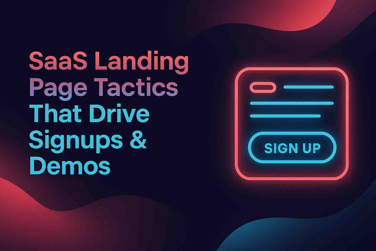
SaaS Landing Page Tips to Drive Signups & Demos
If your SaaS landing page isn’t converting, you’re burning money. This guide shows how to fix it with proven tactics that turn traffic into trials and demos into real growth.
I’ve worked with dozens of SaaS startups—bootstrapped and venture-backed, pre-revenue and scaling fast. I’ve seen brilliant teams with solid products struggle to gain traction simply because their landing pages missed the mark. The common culprits? Lack of clarity. Missing trust signals. No real call to action.
On the other hand, I’ve watched those same teams double their demo requests by fixing just a few simple elements. This isn’t magic. It’s about execution. Once the fundamentals are right, everything else starts to work.
Let’s dig into what actually moves the needle.
Nail the Hero Section: Clarity Over Creativity
The hero section is your first and often only shot to hook a visitor. If they don’t understand what you offer and why it matters in five seconds, they’re gone.
What to include:
- A bold, benefit-driven headline (not a clever slogan)
- A simple supporting subheadline
- A visible CTA that sits above the fold
- A product screenshot or visual that shows real value
- No navigation links or unnecessary distractions
Pro tip: Your headline should state your value proposition clearly. Say exactly what the product does and why it matters, using as few words as possible. Every extra word is friction. Think: “Close More Deals with AI-Powered CRM” versus “Revolutionizing the Way Sales Teams Operate.” One communicates value. The other just sounds nice.

Strip Navigation Links to Eliminate Distractions
Every extra link is a way out. Navigation menus, footers, and outbound links all invite visitors to leave. If your page has one goal—conversion—then give users only two options: take action or bounce.
HubSpot tested this and found that removing top navs increased conversions by up to 28 percent. Focus wins.
Use Social Proof to Build Instant Trust
Visitors need to trust you fast. Testimonials, customer logos, third-party reviews, and certifications all add confidence. Strategically place them near your CTAs to reduce hesitation where it matters most.
Simplify the CTA — One Page, One Goal
Too many choices paralyze users. Pick a single primary CTA—“Start Free Trial” or “Book a Demo”—and stick with it throughout the page. Repeating it consistently builds momentum and reinforces clarity.
Use contrast to make the button pop. Include a verb that signals what happens next. And make sure it’s visible above the fold and again at logical stopping points.

Don’t Oversell — Let the Trial or Demo Close
You’re not trying to sell the product on the page. You’re trying to get a click. The free trial or live demo is where the real pitch happens. So your job is to build just enough trust to get the user to take that next step.
Keep copy minimal. Highlight the pain point and the outcome. Let the product do the heavy lifting once they’re in.
Minimize Friction in Your Form
Every form field is a speed bump. Only ask for what you absolutely need. The shorter the form, the better your conversions—especially for top-of-funnel offers like free trials.
That said, if you’re qualifying leads for a sales call or demo, it’s okay to ask a bit more—just explain why. HubSpot found that trimming even one field nearly doubled conversions. Test it yourself.
Use Visuals That Show, Not Just Tell
Screenshots, product GIFs, and videos all help users visualize the experience. Don’t just decorate—use visuals that reinforce the copy, clarify your value, or highlight results.
Make sure everything loads fast and scales for mobile. A slow or bloated hero image can kill your bounce rate.
Tighten Copy to Maximize Impact
Write like a person, not a pitch deck. Cut fluff. Turn features into benefits. Avoid jargon unless your audience expects it. And most importantly, speak directly to the user’s needs.
Make scanning easy with short paragraphs, bullets, and bold headlines. Keep the rhythm punchy and persuasive.
Design for Mobile First
Over half your traffic is mobile. Your landing page needs to look and function beautifully on smaller screens. That means larger buttons, shorter copy, fast loading, and clear structure.
Sticky footers or persistent CTAs can be game changers on mobile, helping users convert when they’re ready without hunting for the button.
Use Urgency to Trigger Action
Limited-time offers, countdown timers, or highlighting how many people have already signed up can create a healthy sense of urgency. Just make sure it’s authentic. Manufactured scarcity erodes trust.
Add a FAQ to Kill Objections Before They Kill Conversions
Preempt objections with a smart FAQ section. Address common blockers like credit card requirements, cancellation policies, or onboarding complexity. It makes your offer feel more transparent and safe.
Test Everything. Assume Nothing.
The best SaaS teams test constantly. A headline, a button label, or even a testimonial placement can shift results dramatically. Use A/B tests to validate ideas, not gut feelings. And once you find a winner, don’t stop—iterate again.
Struggling to Turn Visitors into Signups?
You’re not alone. Even great SaaS products get stuck when the landing page isn’t pulling its weight. If your conversion rate is low, or if you’re not sure what to fix next, don’t stay stuck.
Get in touch and let’s talk about how we can optimize your landing page, remove friction, and start driving real growth from your traffic.
Why Your Sales Funnel Breaks When You Treat the Home Page Like a Landing Page
Most websites look great. They just don’t sell. Here’s why sending paid traffic to your homepage is tanking your funnel—and…
Reading Time: 5 min
Demand Gen vs. Intent: What Startups Get Wrong—and How to Fix It
[anchor id=1] Startup Founders: You’re Probably Spending Your Marketing Budget Backwards Here’s a hard truth I’ve seen play out again…
Reading Time: 4 min
Why 300% ROI Might Be the Dumbest Goal in Marketing
[anchor id=1] ROI and CPA: Same Coin, Different Sides Everyone loves bragging about ROI. "We hit 300%!" Cool. But what…
Reading Time: 3 min